Card Trick

To start inference I require two things:

1. "It's not unusual" by Tom Jones

2. My especially prepared deck of cards.

The theme song speaks for itself.

For the cards, I begin with a tale of my upcoming weekend adventures. This year I claimed that I was going to play some poker with my buddies while we watched the Super Bowl. As I'm describing my upcoming gambling exploits, I'm opening up a fresh, sealed deck of cards. 

Then comes the hook. I offer to let students draw two cards. If they're both red, they get a nice bit of extra credit (this year plus 2 on their rubric scores!). One red card is a smaller amount of extra credit, but two black cards will result in a small reduction in your grade.

As we've just finished a couple of very challenging assessments (CLT?!), I have plenty of eager students to take the risk. One by one, they draw two black cards. Upon each of these unfortunate incidents, I sadly add their hame to the board with a negative number next to their name.

By the fourth student, there is plenty of clamor to see the whole deck. I belatedly show them the deck--which is all black. I am called many names, I erase the victim's names from the board and pass out a bit of candy to ease their pain. 

Now we have an iron-clad example of a super low p-value! 8 black cards in a row is very unusual from a fair deck.

HT: Roxy Peck first showed me this activity. I've modified it slightly.

iphone-20140129165949-0.jpg

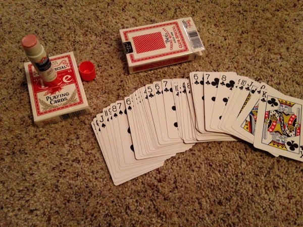
My prep work. A sharp utility knife opens up the bottom and you can slide out the cards and make an all black deck and an all red. Make sure you buy identical decks!

Correlation stations

This post made possible by Rachel at http://purpleprontopups.wordpress.com/ and Shelli at http://statteacher.blogspot.com. This post stems directly from their generous sharing.

I set out this fall to collect some data in an engaging activity. The parameters were:

  • Data that had a variety of directions and slopes.
  • 20 minutes of class time.
  • Data I could use throughout my AP Stats unit on regression
  • Edible

Thanks to aforementioned blogs, I got a huge start on my activity. You can read about all 8 stations I used in this document.

I ran the 8 stations for about 20 minutes at the beginning of each of my 3 AP stats classes. Note that these stations produced great 2-variable data. Anyone teaching lines of best fit could use these stations. This definitely includes the 8th and 9th grade CCSS on linear regression.

Students collected data and put physical dots on big graphs. After the activity, we looked at each graph and described them. This fit well into my standard first day of scatterplots--SOFA. Strength, outliers, form, and association. Students also typed their data into a graphing calculator that was at each station. I used this data throughout the unit to find the line of best of fit and to have students practice interpreting slope, y-intercept, correlation, etc...

A few notes about the stations to whet your appetite.

  • While you would think that length of name and length of hair would have no association, it did! There was a weak, negative trend. But students quickly realized that this was caused by gender grouping. Cool!
  • I had some students really have fun with cheerios. They made MASSIVE circles. One on my circular stool, then a second the width of the student tables. Since both of these circles were very close to a ratio of 3 and were much larger than the rest of the data [(26, 80) and (47, 149)], these points ended up VERY influential. When we removed them, the ratio of the diameter vs. circumference dropped to 2.3. With the influential points, the slope was a very satisfying 3.12. Fantastic example of influential points.
  • Students made typos. And measurement errors. I let the students see these errors. And we talked about fixing and/or deleting them.
  • I had non-influential outliers also. When students tied knots in the wire, some of them got goofy. But they were outliers in the y-direction and were not very influential.
  • I was not demanding enough on forearm measurement, and thus we were not very close to the Golden Ratio! :-( That station requires accuracy!

Overall, I couldn't have been more pleased. The data was real and interpreted smoothly. I lost NO time in my pace. I used the data over the course of several weeks and left the big graphs up for longer.